
A video production mood board is a collection of reference images, like film stills, colour palettes, lighting, locations, and type, that shows everyone how a video will look and feel before anything is shot or animated. It's most useful when the look is the hard part to explain in words. At Oak + Rumble, that usually means two situations: bigger commercial productions, where it sets the direction for set design and lighting, and new clients, where it gets everyone on the same page fast. Once we know a client's look, we usually skip it. For 2D animation, we lean on style frames instead, which show the real design direction before anything gets animated.
What goes on a video mood board
A video mood board holds anything that shows the look and feel you're going for. It doesn't need to be pretty or complete. It needs to get everyone approving the video picturing roughly the same thing.
Depending on the project, that can include:
Frames from films, TV, and ads for camera style and pacing
Lighting references, from bright and airy to dark and moody
Locations and set design, so you know what kind of office, home, or space ends up on screen
People and wardrobe: who's on camera and what they're wearing
A colour palette, ideally pulled straight from the brand guidelines
Type and on-screen text: how titles and callouts will look
Illustration or design styles, for anything animated
Aim for the overall feel, not every tiny detail. If the meeting turns into a debate about the exact shade of a coffee mug, the board has done its job and then some.
When a mood board earns its place
A mood board earns its place when the look depends on decisions that are expensive to change later, or when you're working with a team for the first time. For us, that comes down to two cases.
Bigger commercial productions
On a larger commercial, set design and lighting get locked in long before the camera rolls. A mood board lets the client react to a lighting style or a type of space while it's still a picture on a page and changing it costs nothing. Changing it on set is a much more expensive conversation.
New clients
With a new client, a mood board is the quickest way to find out what "modern and clean" actually means to them. (It never means the same thing twice.)
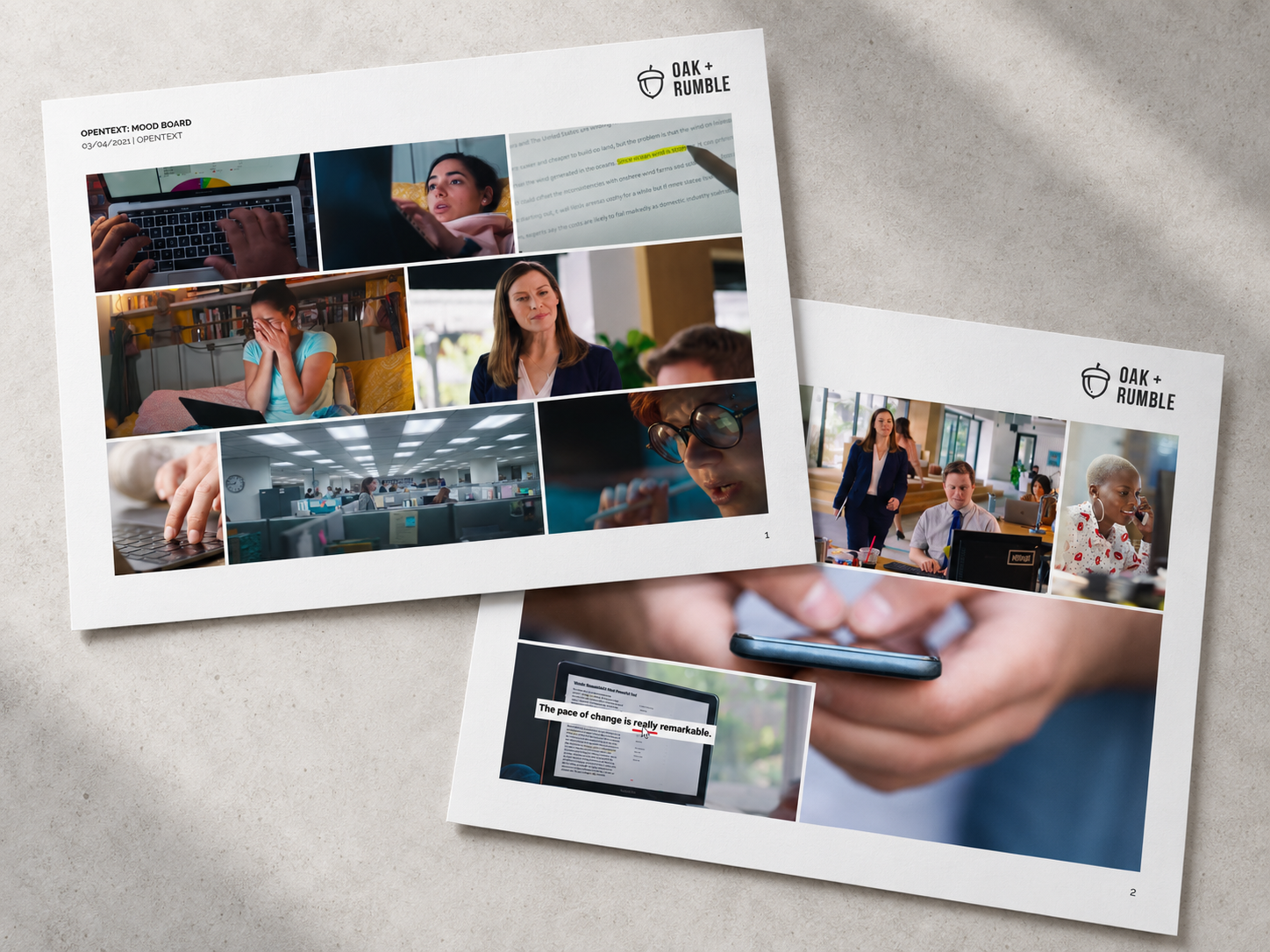
That's how we started on OpenText's Navigator video. The board pulled together references for the people, the workspaces, and how the on-screen text would highlight key lines, so everyone agreed on the look before production started.
Once we've worked with a brand for a while, the mood board mostly retires. We already know the look, the colours, and who needs to see the cut before it ships. That's one of the quieter perks of an ongoing video production partnership: less time getting aligned, more time making the video.
Style frames: what we use instead for 2D animation
For 2D animation, we've mostly moved on from mood boards to style frames. A style frame is one or two storyboard frames designed to look exactly like the finished video, so the client can approve the design direction before anything gets animated.
It's a simple idea that saves a lot of pain. Animation takes real hours, and nobody wants the first look at the design to be a fully animated scene that heads straight back to the drawing board. Style frames put the big creative call up front, while it's still quick to change.
Not every project needs every step, but the full path looks like this:
Mood board.
References that set the general look and feel.Style frames.
One or two frames designed to final quality, so the design direction gets approved.Full storyboard.
Every scene designed, with the script and action notes under each frame.Animation.
Everything starts moving.
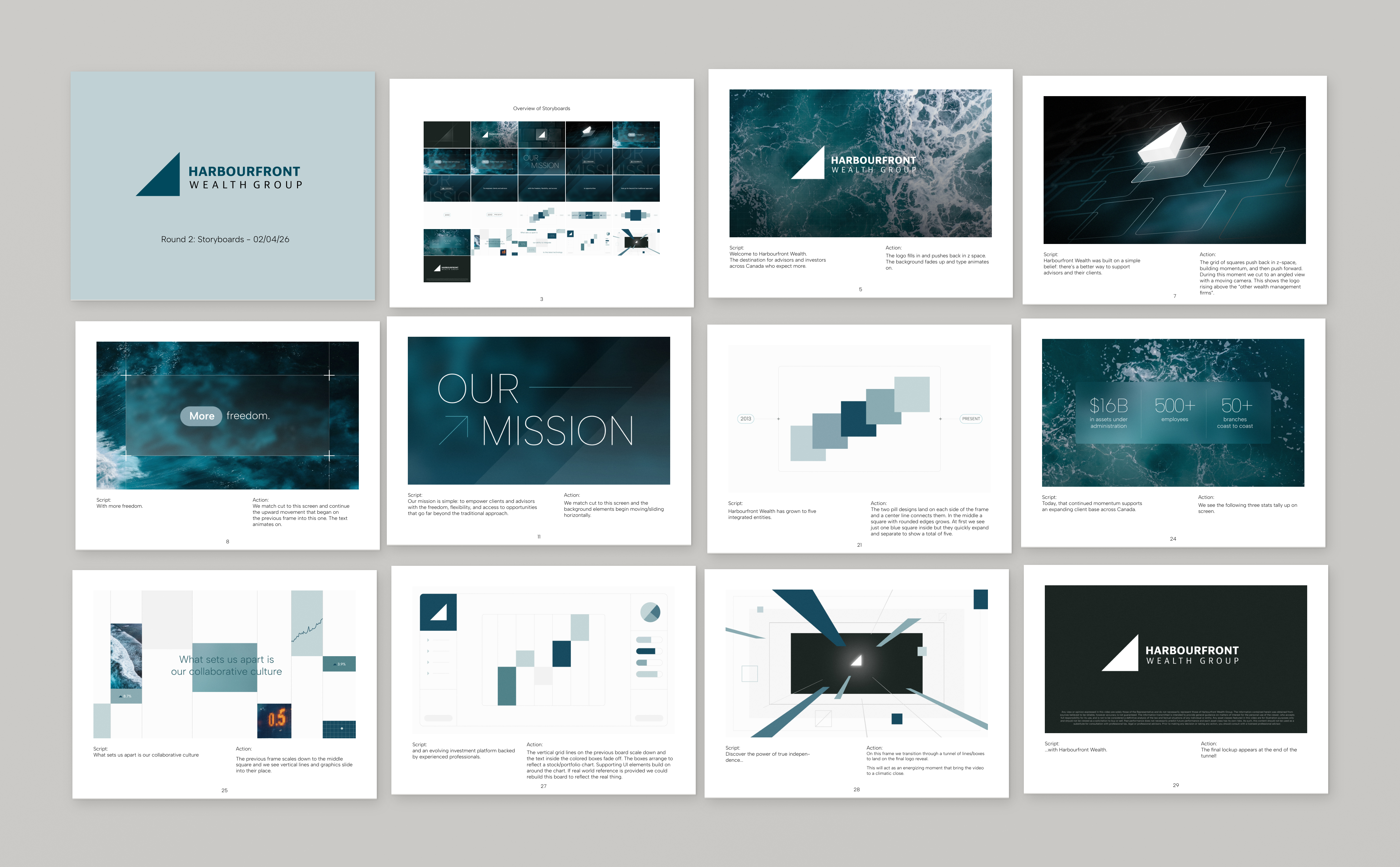
For Harbourfront Wealth Group's promo video, we skipped the mood board entirely. Their brand documents already gave us the colours, type, and logo, so we built style frames straight from those. Once the design direction was approved, the full storyboard and animation followed.
How to make a mood board without overthinking it
A mood board can be as simple as a document full of screenshots. We've built them in Figma, which is great for this, and we've also just dropped photos into a Google Doc. Both work, because what matters is the references, not the layout.
Start with the brand.
Pull the colours, the type, and any past videos the team loves (or quietly hopes you'll never mention).Collect more than you need.
Screenshots from films, ads, stock sites, and past projects all count.Cut it down.
Keep the images that agree with each other. If two references pull in different directions, pick one.Label what you like.
A short note like "this lighting, not this location" saves a lot of guessing.Share it early, and widely.
Get it in front of everyone who'll approve the final video, including legal or compliance if they'll see the cut. Agreeing on the look now beats finding out at the final review that someone pictured something else.
You can see more of how these projects turned out in our work.
Frequently asked questions
What's the difference between a mood board and a storyboard?
A mood board shows the overall look and feel of a video using reference images. A storyboard lays out the actual video scene by scene, usually with the script and action notes under each frame. The mood board comes first, and the storyboard is built once the look is agreed.
Who makes the mood board, the client or the agency?
Usually the agency builds it, since turning references into a clear visual direction is part of pre-production. Clients are welcome to send examples of videos they like, and those often end up on the board.
Whatever the tool, the job's the same: everyone pictures the same video before anyone spends a day making it.
 Book a call